 Microsoft has revealed a new logo today for Windows 8, one that features a single-color design and will be based on the Metro user interface.
The new logo has an angled window, which Microsoft says will give a sense of motion "aligning with the fast and fluid style you'll find throughout Windows 8."
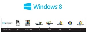
Design consultants Pentagram came up with the new look, and the firm wanted to move away from the current logo which they believed looked more like a flag than an actual window. Says Microsoft of the decision: "'Windows' really is a beautiful metaphor for computing, and with the new logo we wanted to celebrate the idea of a window, in perspective."
Metro, which is part of Windows 8 for PCs and tablets, is touch-friendly and feature tiles rather than the icons connecting to apps that have been seen since the original Windows with GUI.
Windows 8 is expected to be available in the fall, with a consumer preview being released in the next month.


No comments:
Post a Comment